Welcome to Nspired Spaces! If you’ve made it here, you’re probably sitting on your sofa staring blankly at a series of “white” sample patches on your walls that have been patiently waiting on a selection for months (3 to be exact) while sipping on your coffee and having an internal debate that could give the presidential debate a run for its money about which white is whiter. No? Just me? Cool. Cool.
No worries! My long, arduous journey to selecting Sherwin Williams Alabaster as the right paint color for both the exterior and interior of our home can be your quick resource for everything you need to know about Alabaster.
If you’ve been racking your brain trying to find the perfect white for your newest design project, let me let you in on why SW Alabaster may or may not be the best fit for your home.

When we first looked at our home prior to purchasing it, I wasn’t in love. I didn’t have the warm fuzzies that you think of when your forever home comes to mind. In fact, it took some persuasion. To be honest, it was a beautiful home but it needed some TLC. As I was in my third trimester of carrying our firstborn, I didn’t quite have the vision, or shall I say motivation, to go through a remodel all while trying to figure out parenthood and caring for a newborn.
Fast-forward to the end of the said trimester, and I was panicked, eager to get us moved and quickly before our son made his grand debut. All the items on my list of things needing updating quickly were put on ice as I delivered our sweet baby boy the week after moving in.
Now, why is this important? Because out of all the things on that list, painting of the exterior and interior of our home was a must. And that must be that it needed to be white. Alas, we are taken back to staring at those “white” sample patches on the wall. Who knew selecting a white would be so difficult? I mean, white is white, right? WRONG!!!
Here’s what we learned during the process of having our entire home painted in Alabaster.

Now, we did our research before coming to the decision on Alabaster. EXTENSIVE research. We scoured every blog post, and every Pinterest board to find examples of what it would look like on our walls. I knew I wanted a soft white but dreaded, no loathed, the thought of having something come out too yellow.
With that in mind, Alabaster has an LRV of 82. Meaning, it’s within the white range without being overly harsh or too cool. For those of you (like me) who didn’t know what an LRV is. LRV, or Light Reflectance Value, is a 100-point scale as to how light or dark paint color will appear in your space. The higher the value, the lighter and more white the color will appear. The brightness of the color is further enhanced by the amount of natural or artificial light that enters the room. At an LRV of 82, I figured this would be the perfect blend that I was looking for.
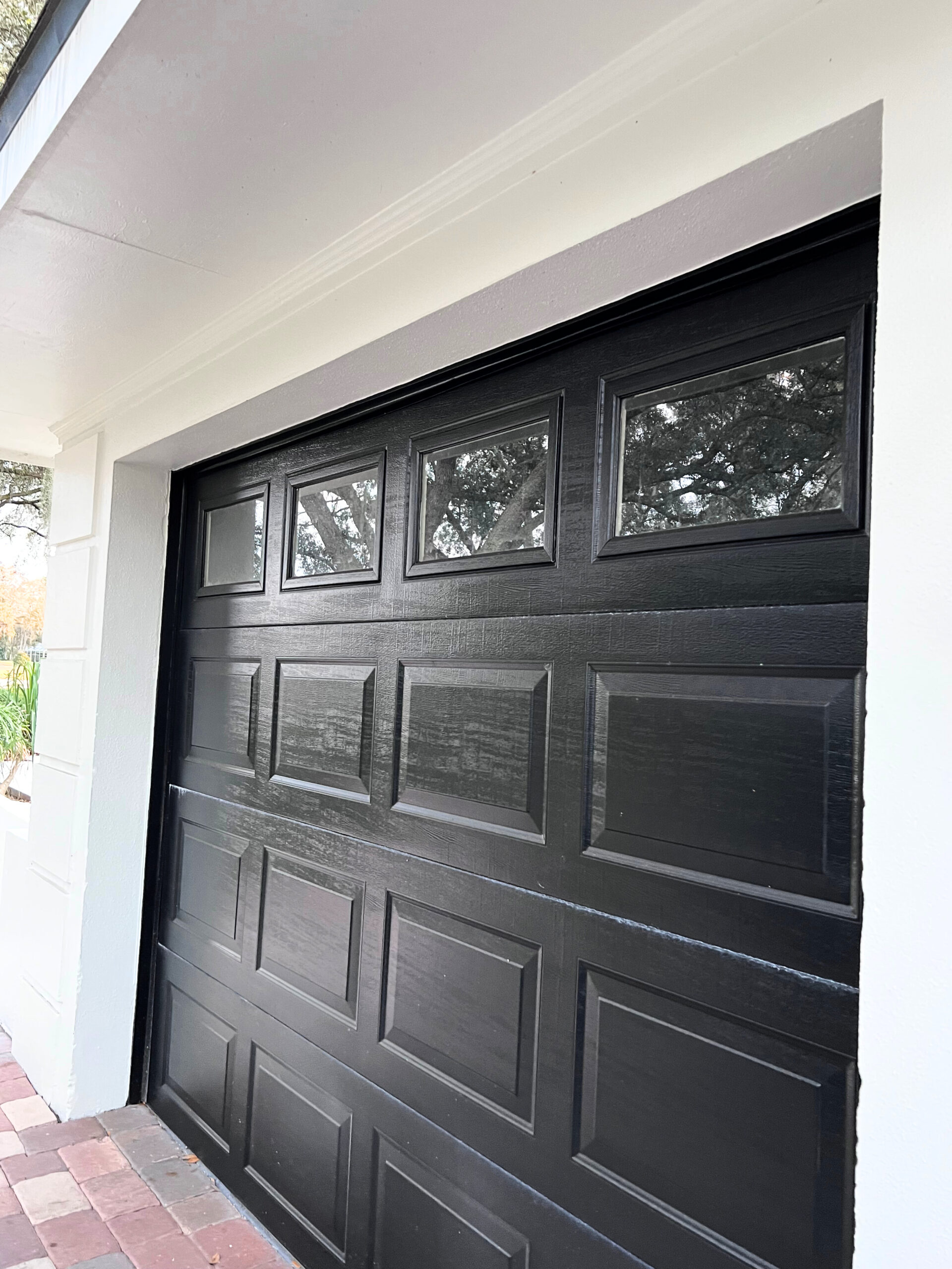
In our case, the exterior of our home received an ample amount of natural light allowing for the color to really shine. The exterior is bright but not overly white. It has a softness that is very aesthetically pleasing making it feel warm and inviting.

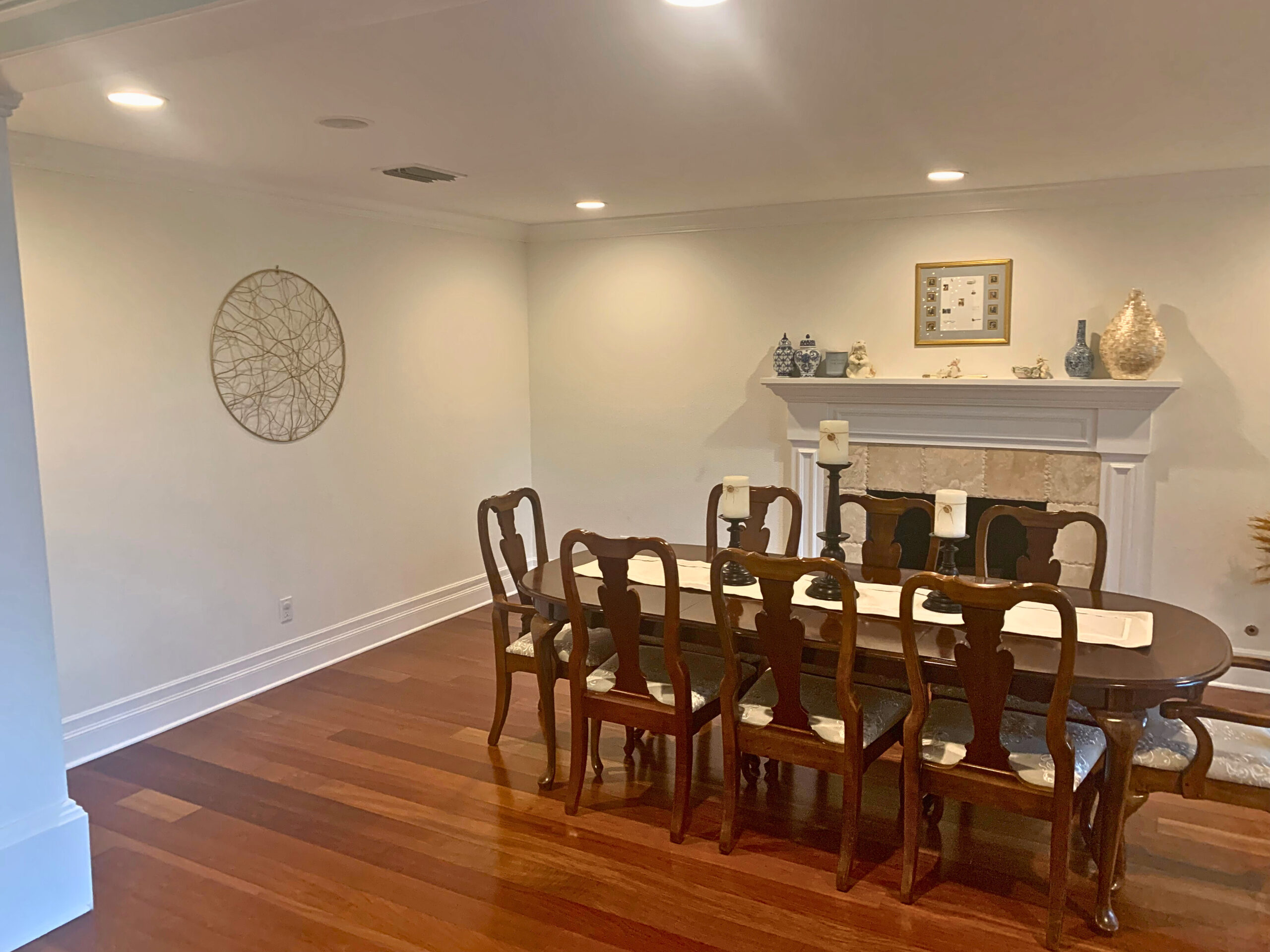
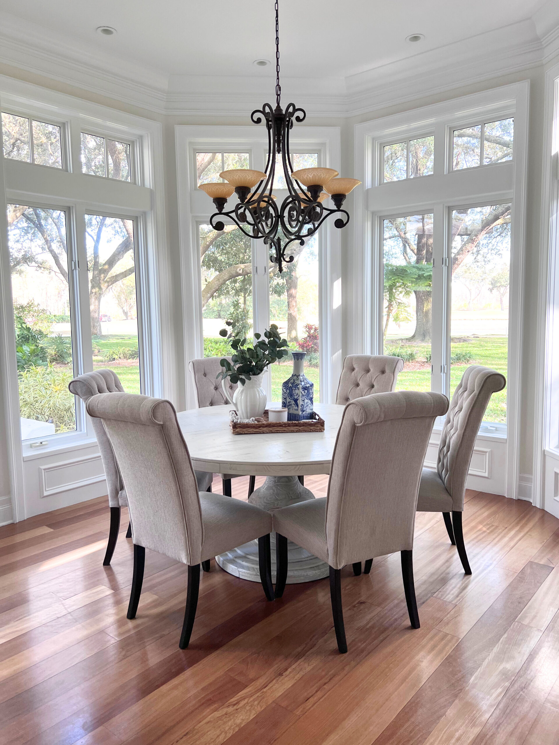
Where things start to get a little tricky for us was the interior. In certain spaces and at certain times of the day, the walls have a beautiful, soft white appearance. At other times and in areas that received more natural light, the walls started to reflect more of a yellow tone.
You might be asking yourself, didn’t she just say that more natural light pulls out the brightness of the color? Yes, indeed I did. The issue with the rooms in our home that have an abundant amount of natural light is that it is not direct light. Our backyard is covered by a canopy of beautiful live oaks.
While I do love the way the new interior paint color came out, it’s not quite what I had envisioned for our space. Here’s where I think we got it wrong.
As important as it is to select the right wall color, it is just as important, if not more, to select a coordinating accent color for your trim and ceiling that will not pull the wrong tones.
The exterior of our home utilizes black accents in the roof shingles, eaves drip, and garage doors. This contrast doesn’t pull away from the brightness of the wall color of the home. In fact, I feel that it accentuates the color by allowing it to pop against the darkness.

For the interior of our home, on the other hand, we selected SW Bright White for our trim. This cool, clean shade of white creates a crisp contrast against the wall color, but it lacks the depth and warmth I initially envisioned for our space. To achieve the desired effect, I believe opting for a warmer white or a subtle off-white shade would have been a better choice. This would have added a touch of coziness and complemented the overall ambiance we were aiming for.
Additionally, considering the existing elements and decor in the room is crucial. Taking into account the furniture, flooring, and lighting fixtures can help guide the selection of the perfect trim color that harmonizes with the entire space.
In the end, the journey of selecting the perfect white paint color for your home is a personal one. While Sherwin Williams Alabaster offers a beautiful soft white option with an LRV of 82, it’s important to consider the lighting conditions in your space. Natural light, whether direct or indirect, can significantly impact how the color appears on your walls. The exterior of our home showcased the brightness and warmth of Alabaster, while certain areas indoors reflected a yellow tone due to the abundance of indirect natural light.
Another crucial factor to consider is the contrast between the wall color and the trim. While we achieved a crisp contrast with SW Bright White trim, it lacked the depth and coziness we desired. In hindsight, opting for a warmer white or an off-white shade for the trim would have complemented the overall ambiance we envisioned. It’s essential to also take into account the existing elements and decor in the room to create a harmonious and cohesive space.
Finding the perfect white paint color involves considering the lighting, contrast, and overall aesthetic you wish to achieve. By taking these factors into account, you can confidently select a white paint color that reflects your style and brings your vision to life, creating a truly Nspired Space.